TIMELINE
3 months, Nov ‘22 - Feb ‘23
My role
Research, Interaction Design, Visual Design, Prototyping
Team
myself, Lead Designer, PM, Engineering
IMPACT
40% in User Stickiness
Overview
Screener is the flagship product in Messari’s enterprise suite, but its UX/UI hadn’t been updated in four years, leaving it clunky and outdated. I tackled a greenfield design effort while simultaneously establishing a brand new design system.
My primary challenge was to design a powerful yet flexible filtering UX capable of handling complex financial data transformations.
Following the launch, Screener has a high impact on retention. The filtering functionality has been consistently praised by users for its high level of customization and usability.
CONTEXT
A screener is a tool used by investors to filter and narrow down potential stocks based on specific criteria like price, market capitalization, etc. Messari’s Screener was one of the most used features in our Enterprise subscription, but had not been touched since its first launch in 4 years.
PROBLEM

Research
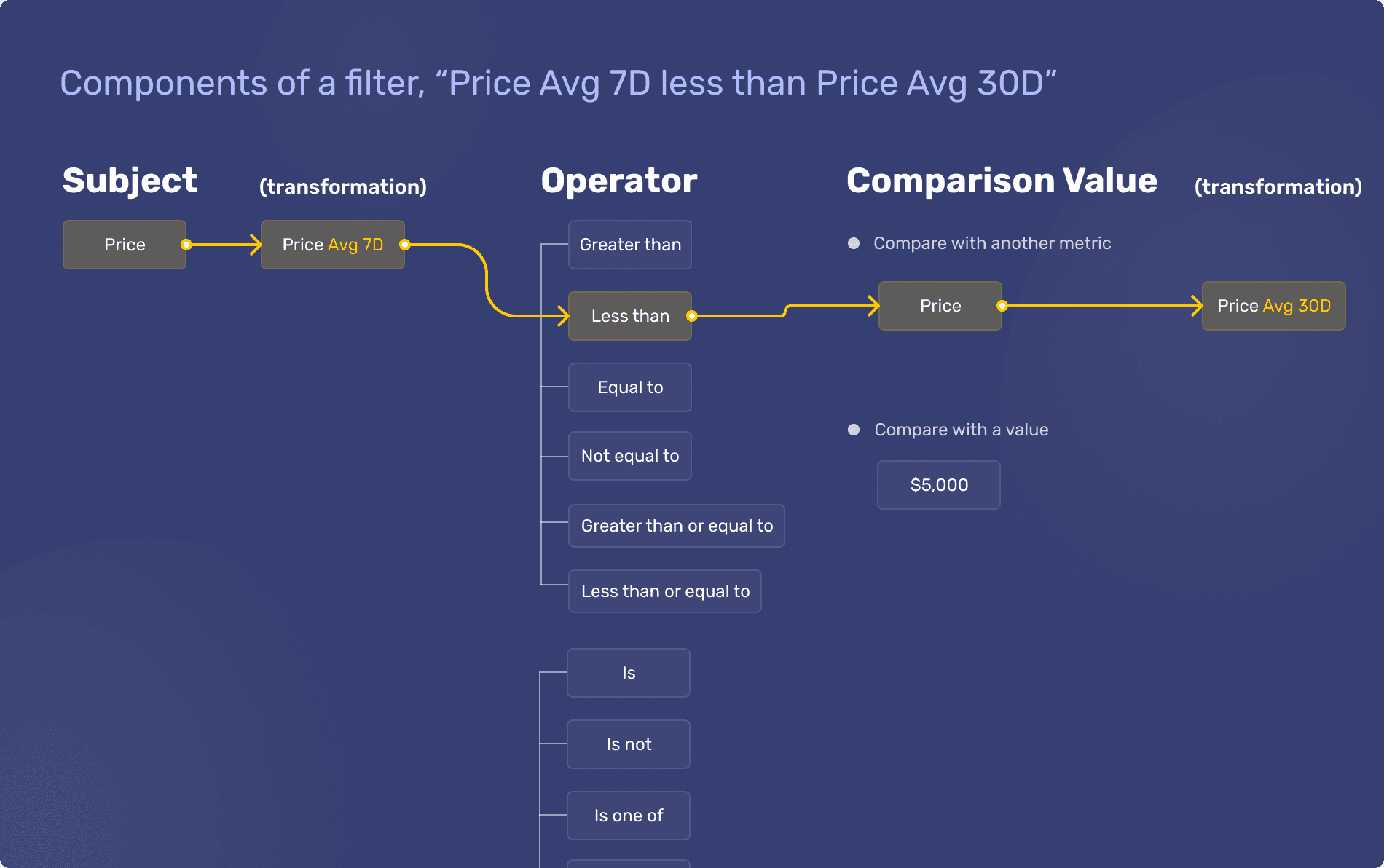
I worked closely with the PM on sample screens in order to understand what type of customization was required. I draw many many diagrams breaking down the anatomy of a filter, like below.
I explored widely, prototyping various approaches to building filters. Excited by the modal’s scannability, I presented the "Modal - Strict" option to the team. However, my enthusiasm was quickly tempered when it was pointed out that duplicating a metric—such as creating multiple filters based on Price—was very difficult in that design.

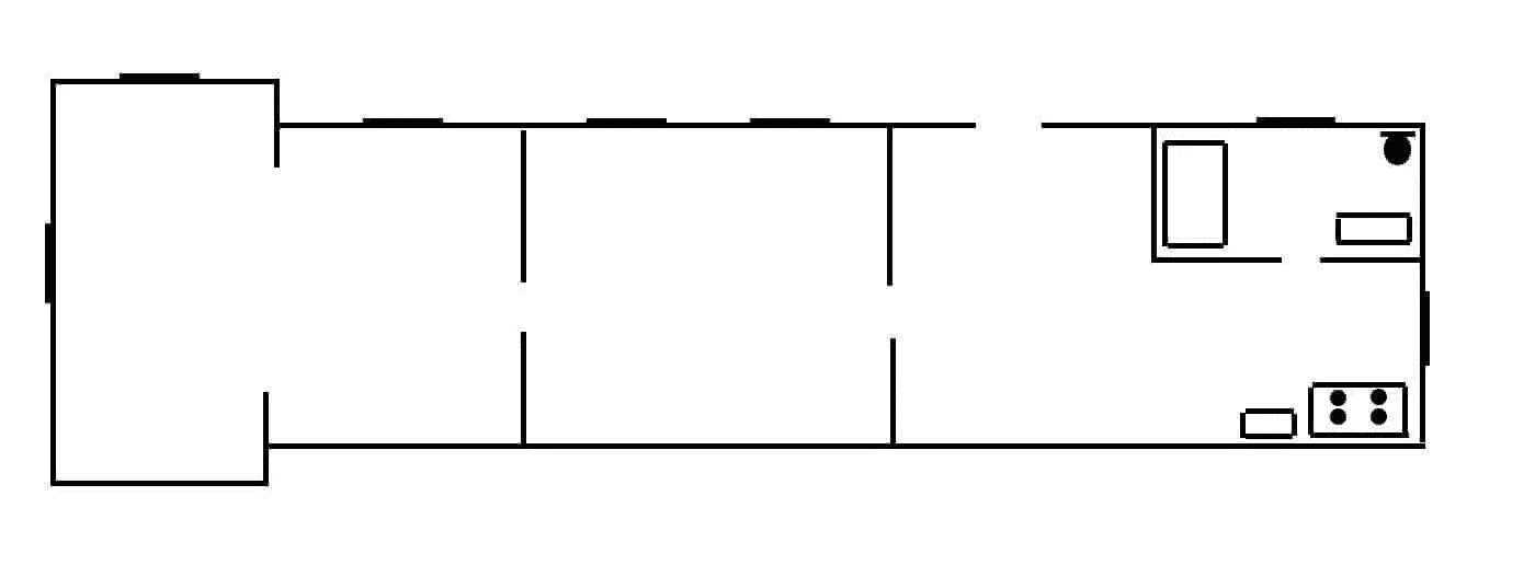
NYC railroad apartment led to a breakthrough for inline typeahead filters 🧠
I was stuck on how to approach filters. But I didn’t give up, trying out different approaches. One day a literal shower thought came to me that the cursor could move through filter sections back and forth like how a person moves through a railroad apartment in New York.
Metric
Operator
Comparison value
Inspiration - a typical railroad apartment layout

Filters can work the same way!
Ok great… now will the team buy into the vision?
I finally felt like I broke through with the inline filters idea, but, at this point, no one was immediately bought in.
Generating excitement with hi-fi prototyping and Excel metaphor
Rather than just explaining the idea, I created interactive prototypes that demonstrated how users could filter large datasets—making the experience feel fluid and intuitive. To drive alignment, I drew a clear comparison to Excel, a familiar mental model. This helped the team quickly grasp the potential impact and get excited about the direction.
REFINEMENT
Focusing on the finer visual design details

I took special care to refine the filter chips to improve their affordances, making it clearer that each section of the chip is interactive and clickable. Since the interactions are a keyboard-first experience, adding transition animations improved the usability of editing.
Reflection
Screener filtering is well-loved by power users for its customization and flexibility
After launch, screener has seen a high impact on retention for the Enterprise tier. The filtering system has been consistently praised by users for its high level of customization and usability.
"I keep Screener up all day every day."
— Enterprise customer
"Really enjoy the customization (filters, re-ordering columns etc...), especially in these higher volatility periods."
— Enterprise customer
Future opportunity — engaging the "viewer" persona

Analytics revealed that the majority of users were screener viewers, not builders. In hindsight, we focused on creating a "Cadillac for builder" without addressing the needs of the larger viewer audience.
If I could do this project over again, I would concentrate on "community screens"—a feature in v1 where users could post their own screens and allow others to remix them. This shareability aspect had the potential to drive engagement, especially among non-builder users. Prioritizing features for this dominant user group could have led to even greater adoption.
